Typographic Redesign
It all started with a recommendation of a friend, that was to never read The Elements of Typographic Style shortly before you have to finish something. Since then I have finished many things so it was time for insightful procrastination. I read the book and now I cannot unsee it. Bad typography – everywhere, but especially in tech. So I had to redesign this blog. After consulting The Elements of Typographic Style Applied to the Web which was partially helpful, I spend hours if not days on it. And here it is: the grand redesign.
Constraints
A blog is not a printed book. The size can change due to different screens and orientations, fonts can change due to user preferences, people can zoom the page, people might for some reason disable JavaScript, accessibility must be kept in mind, etc. On top of that I do not have the resources to spend as much time into a post as someone would spend into a book page. Posts in this blog are simply typed in CommonMark (Markdown) and are rendered by Zola. The base theme is Even so I do not need to design the entire layout. Most of the design work should be done in CSS for efficiency reasons.
So every solution I come up here must work comfortably under these constraints. Sure the result might not be as beautiful in all cases – e.g. I cannot fix small-resolution screens or bad user font choices – but at least the whole things should not blow up when disturbed slightly.
Page Layout
One important aspect to get right – at least according to Robert Bringhurst is the vertical flow or rhythm. Everything on the page has to be aligned to the line height of the next, so if you would put it next to a page filled with text, lines would be aligned. To check that this is indeed the case, click here.
Note that this works better in Firefox than in Chrome. The latter just decided to do really inconsistent subpixel rendering, e.g. making paragraph lines sightly smaller than full pixels but use full pixels for margins.
Paragraphs
Paragraphs in web are by default somewhat ugly. They always come with huge margins, are cluttered, and the text has no flow whatsoever. I have fixed all of these things. This only works as of recently, because browsers did not support hyphenation that well the last time I have checked. And there is some JavaScript-driven backup through Hyphenopoly in place.
Since paragraphs do not have horizontal margins any longer, I am using the good old bookstyle indentation to separate them which gives the page a more even look.
Numbered Lists
- Directly after heading. Note how numbers are places outside the paragraph boundaries. Numbers are oldstyle proportional and are separated from the text solely by an en dash. No additional dot is needed.
The paragraph afterwards is not indented.
And another list to for demonstration:
- First item
- Second item that is very long and should hopefully occupy at least a few lines to illustrate how it is also justified and hyphens work. This is important for very long list items since they shall fit well into the overall structure of the page. Imagine what would happen if lists would out of the sudden look very different than ordinary paragraphs…
- Third item
- With sublist
- …
- Further down
- …
- Forth item
- not numbered
- …
Unordered Lists
- Directly after heading. Note how numbers are places outside the paragraph boundaries. Instead of the browser-provided disk the bullet symbol • that comes with the font is used which is separated from the text by an en dash.
The paragraph afterwards is not indented.
And another:
- First item
- Second item that is very long and should hopefully occupy at least a few lines to illustrate how it is also justified and hyphens work. This is important for very long list items since they shall fit well into the overall structure of the page. Imagine what would happen if lists would out of the sudden look very different than ordinary paragraphs…
- Third item
- With sublist
- …
- Further down
- …
- Forth item
- numbered
- …
Table
| Directly | After |
|---|---|
| The | Heading |
The paragraph afterwards is not indented. Tables are stripped down to the minimum which means no lines, shadows, or cell background colors. Padding is organized in a way so that the rhythm is kept.
And another one:
| No Align | Right Align | Left Align | Justified |
|---|---|---|---|
| Some content | … | Foo | |
| Another line | foo | Bar |
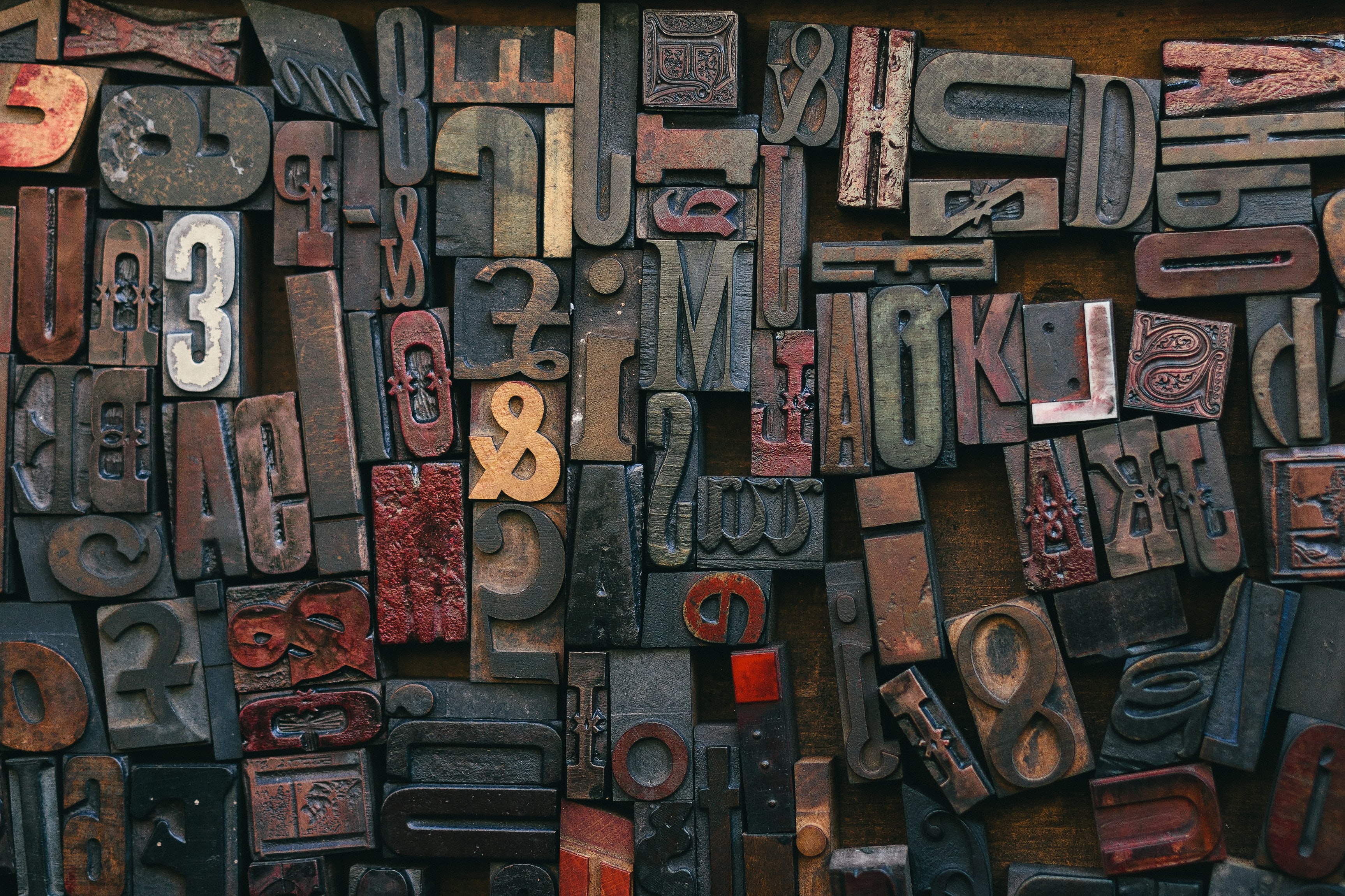
Images

The one above is quite tall (ration 1:10). I try to expand all images to the same width as the paragraphs. If they get too large by doing so (measured in number of lines), they are centered. They should – as all the other elements – occupy a fixed number of lines. I do not want to mess with the aspect ratio or trim the image though. Instead I add a some additional margin at the bottom. So if for example an image occupies 8.3 lines, there will be an additional margin of 0.7 lines. Sadly this is not possible with pure CSS or other HTML trickery, so I have some small JavaScript running that first measures the pixel-equivalent of a single line and then uses this value to create the additional margin for every image. For users without JavaScript that means they cannot enjoy this effect, but it won’t break the entire site.
Note the simplicity of the images: no border, no shadow, no additional background. The latter one is also important for images with transparent elements like diagrams.
Here is one in 1:1:

And here one with 9:1:

And here one with 10:1:

Here is the same limited by height:
Images (side-by-side)
And here are two images side-by-side. They can also have different aspect ratios:
Or they are limited by height:
Images (wrapped)

And here is the same images, but it is wrapped in a HTML paragraph (<p>) due to Markdown processing.
Here is one in 1:1:

And here one with 9:1:

And here one with 10:1:

Maths
$$\int_{-\infty}^{\infty} \frac{1}{\sigma \sqrt{2\pi}} e^{\left(\frac{x-\mu}{\sigma}\right)^2} dx = 1$$
The paragraph afterwards is not indented. Inline is also supported, like \(a^2 + b^2 = c^2\). The typesetting is done via \(\KaTeX\). Note that since the math symbol set is quite special and the typesetter needs detailed font metrics, a special font is used. I could probably get KaTex to use main font to some extend but I think it is not worth the effort. Just remember to scale the math font appropriately. The sizing issue for blocks is the same as for images by the way, with the same JavaScript-driven solution.
More blocks:
$$\int_{-\infty}^{\infty} \frac{1}{\sigma \sqrt{2\pi}} e^{\left(\frac{x-\mu}{\sigma}\right)^2} dx = 1$$
Code
fn directly_after_header() {
    ...
}
The paragraph afterwards is not indented. The padding is designed to fit into the flow. Note that this is the second element where the font is different and that it is quite hard to find a properly fitted monospaced font. Here I use Source Code Pro. The syntax highlighting is provided automatically by Zola.
Here is some more code:
{
    "first": "foo",
    "second": 1
}
Inline Code
this_is_some_codee_directly_in_the_first_line_
Here is some more code. Special characters should stay intact: ""''...x-x--x---x.
It should also not use hyphens do_not_put_a_hyphen_in_here because_this_would_break_the_code and_would_confuse_people (breaking spaces is fine though).
Blockquote
Directly after heading.
The paragraph afterwards is not indented.
And another one:
This is a tiny quote that shall be long enough to run a few lines so it illustrates how quotes look like. Namely the should be justified and hyphens should be present. Imagine if block quotes would just look massively different look than ordinary paragraphs…
Footnotes
This1 is a footnote2. They are always3 in-order 4.
Details
Directly after heading.
Details directly after heading.
And another one: And another one.Another One
Links
Links should be underlined and should not intersect with characters like in hyphen, question, or fog. They also work in bold, italic, bold italic, inline_code, SMALL-CAPS, and strikethrough.
Font
The main font must provide a solid set of features shown below. Please value the font you use. It takes a good effort to build and maintain a good font. That means if the font is not free – which means it is published under a license like the SIL Open Font License – you likely have to pay for it. Everything else is called stealing! The font used here is Alegreya.
Numbers (1234567890)
There are multiple ways to display numbers:
| Figure | Spacing | Examples |
|---|---|---|
| lining | proportional | Test |
| lining | tabular | Test |
| oldstyle | proportional | Test |
| oldstyle | tabular | Test |
For numbers within a paragraph like 1234567890 oldstyle proportional is used. In headings lining proportional is used. In tables it depends on the context but for columns that contain only numbers oldstyle tabular works best.
Umlauts & Diacritics
Some diacritics – and umlauts in German – that I probably use:
- ÄËÏÖÜäëïöü
- ÁÉÍÓÚáéíóú
- ÀÈÌÒÙàèìòù
- ÂÊÎÔÛâêîôû
- ÅŮåů
There are of course many more. I encourage you to have a look at the Wikipedia article to learn more about scripts of other nations.
Italic
This is some italic for you!
Bold
This is some bold for you!
Bold Italic
This is some bold italic for you!
Strikethrough
This is some crossed out text for you!
Ligatures
- Latin: ff ffi ffl fi fl
- Scandinavian: ffj fj
- Other: Th Qu
Kerning
Yo (and) 1+2 [x]
Small-caps
For abbreviations like WWW, or USA; and for headings. They also exist in BOLD, ITALIC, and BOLD-ITALIC.
Punctuation
- periods & commas: foo. bar,
- questions & Co: ¿foo? ¡bar!
- colons: foo; bar:
- dashes: - – —
- quotes: “foo” ‘bar’
- misc: …
Emojis
Emojis like 🙂 ⚓ ✅ 🌶︎ are usually colorful and fit better into some messenger app than into a publication. Sometimes however they are useful. Luckily Noto Emoji provides a solid set of monochromatic symbols. They can even be bold 🙂.
Other Symbols
- &
- # § @
- ß
- $ € £
Image: by Bruno Martins on Unsplash